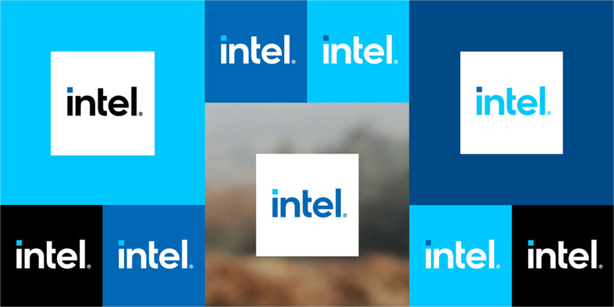
Intel is “transforming its brand” and it plans to roll out the branding over time rather than introducing all at once. The company started with the launch of its new 11th Gen processors that is said to reflect one of its biggest technical innovations in years, alongside the new Intel logo.
Intel has stated that the new logo “honors its past by bringing forward some of the strongest design elements while simplifying and modernizing them to bring dimension and breadth extending its brand into the future.”
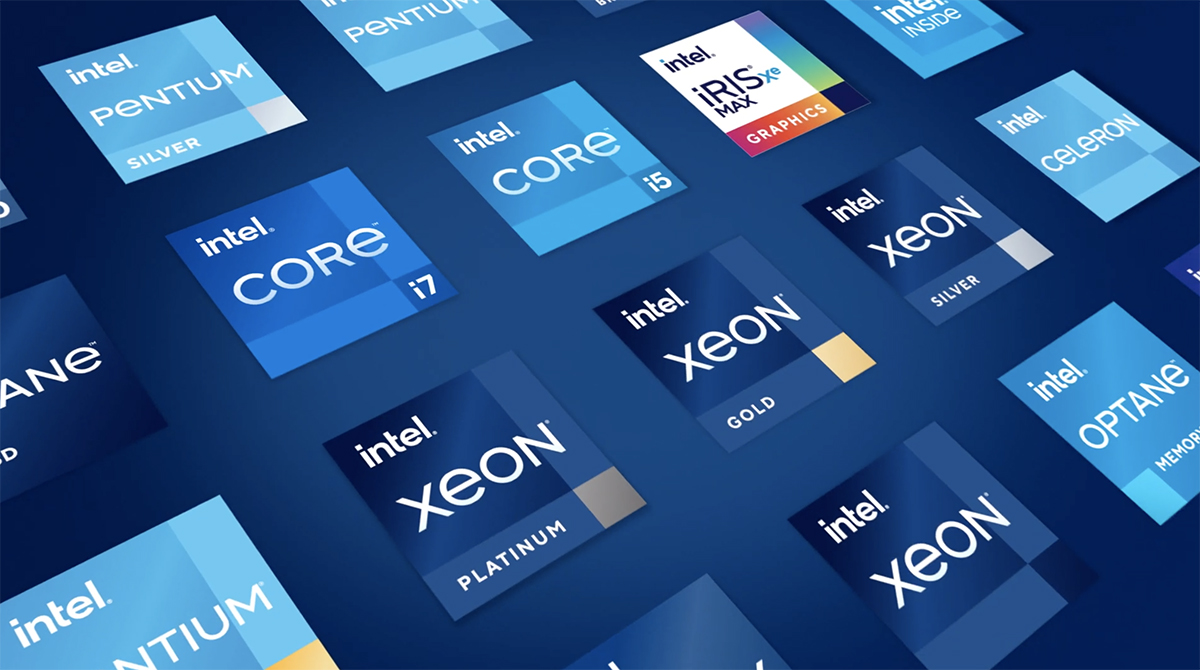
The logo is fresh and the fonts are boxier, yet inherits quite a few design elements coming from the first iteration — just look at the “i” with a square dot. It’s the third iteration with the previous two, introduced back in 1968 and 2006. And Intel will be using its everywhere from its Xeon servers to Optane memory chips.
Despite the classic Blue, you will see more colors as well — see the dot in “i” in light blue, yet the Blue remains strong.
Though the Intel five-note “bong” is still around, the company affirms a “modernized version” matching the new logo in the later part of 2020.