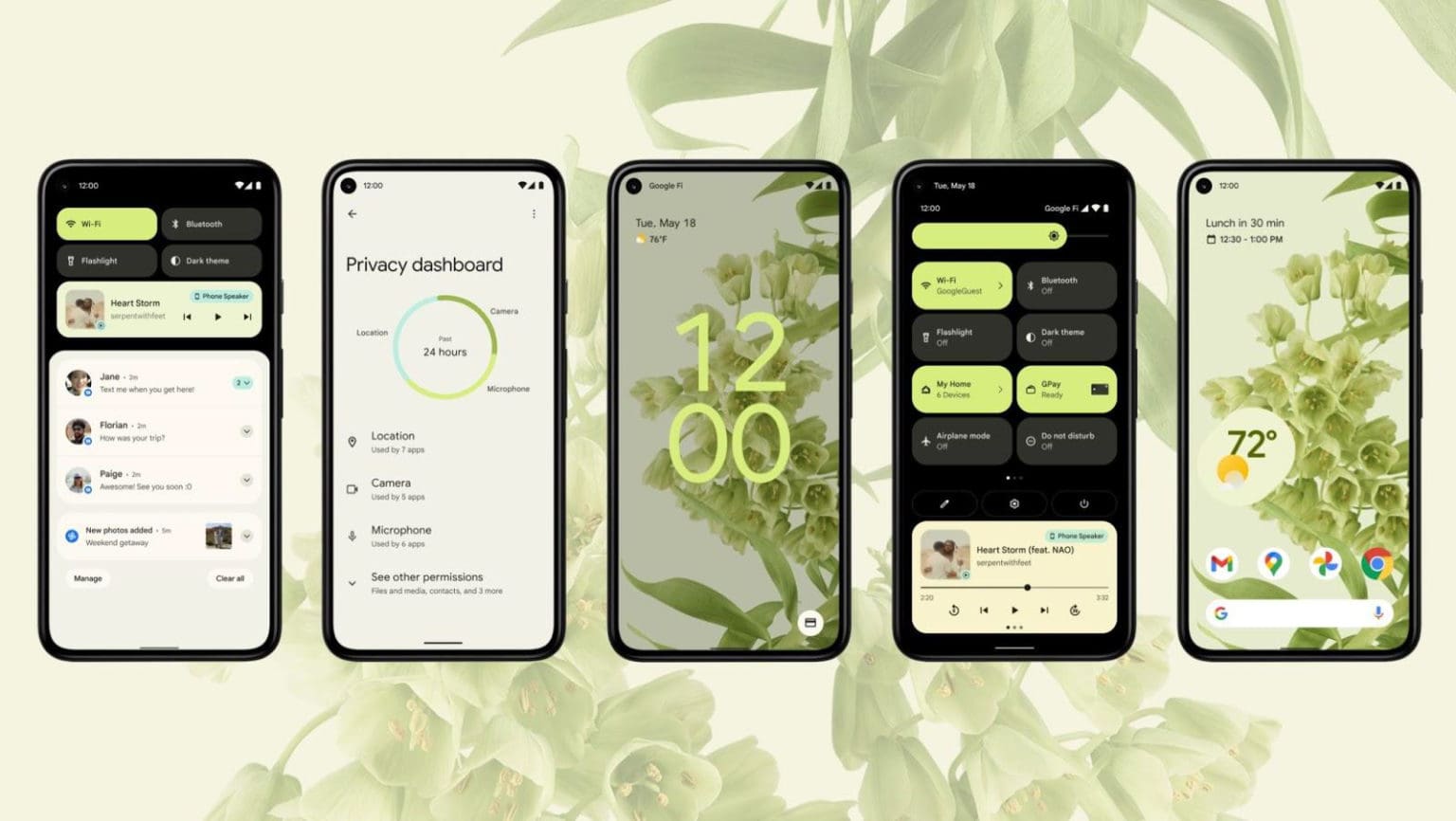
The Google I/O 2021 edition commenced yesterday. Expectedly, the first day’s keynote was focused on the company’s products, though Android 12 got the most attention.
Launching the beta, Google affirmed a major design revamp in the upcoming iteration of Android. As per Google, “Android 12 includes the biggest design change in Android’s history.” The company thought about “the entire experience, from the colors to the shapes, light, and motion.” This means “Android 12 is more expressive, dynamic, and personal than ever before.”
Here’s a quick recap of the Google I/O’s keynote on Android 12 on the first day.
Android 12: “Expressive dynamic, and personal than ever before”
Android has successfully been a go-to operating system for users looking forward to personalization and customization. An Android device can look and feel completely different from the other depending on what its maker and owner decides. Even a non-techy person has an option to do so considering a range of launchers, icon packs, and color schemes available.
Android 12, on the other hand, takes customization to the next level. Now, it’s simple and sometimes automatic. Google introduces new icons layout and visual transitions for as it puts it, “more personal than ever before.”
Color extraction
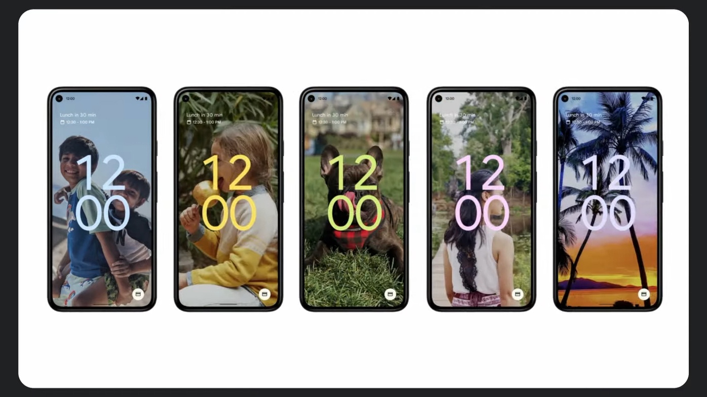
You might have already fiddled around color palettes in your Android smartphone if you use Android 10 or higher. These include buttons, Quick Tiles notification, etc. Remember how you needed to change them yourself on Android 11? Well not anymore. Android 12 is able to methodologically examine the wallpaper on your device, hence bring about color extraction.
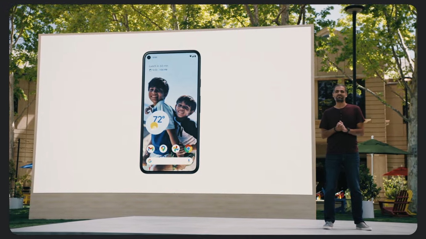
The system dictates dominant and complementary colors in the wallpaper thereby applying them over the entire system. Meaning, all you have to do is apply your favorite wallpaper and leave it to the system to extract the colors and use it across widgets, icons, highlights, backgrounds, button, notification, and even lock screen. This is to a personalized look without putting in more effort for customization from your side.
On the contrary, if you are someone who likes to make an effort, you will definitely enjoy it more. With the system doing half your work, you can later reach out to the settings to further customize colors as required. Not to mention, the color scheme now applies to a larger part of your system, compared to what we have been seeing in the older versions of Android.
Always-on display (AOD) and transition animations
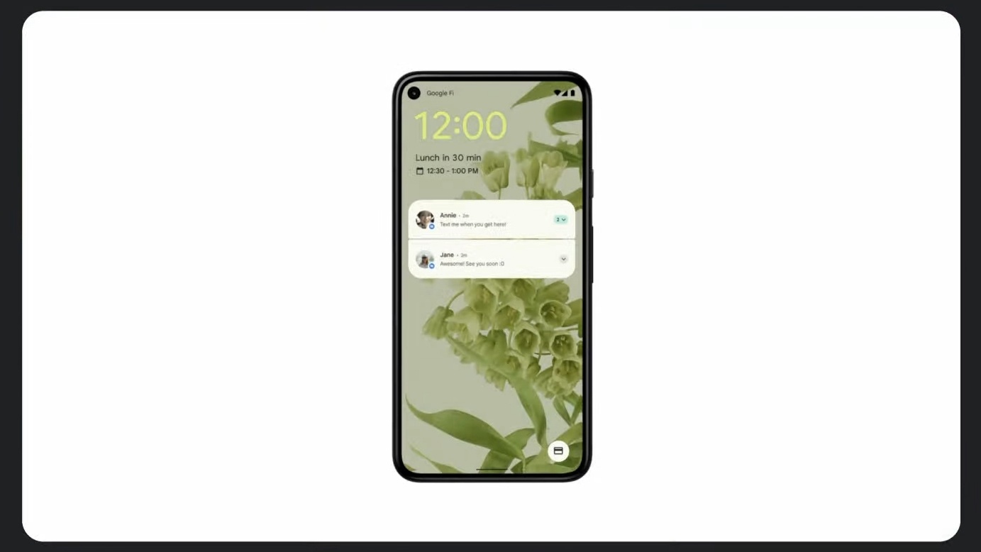
Android 12 brings the always-on display in a fresh look. In the middle of the screen lies a massive clock. A lookalike is at the lock screen. Now, if you don’t like the idea, it’s much more than what you are thinking.
The clock is able to shrink while the transition to the top left part of the display during notifications. The idea is that you will now be able to tell if you receive a notification even from a farther distance. All you need to notice is the massive clock shrinking.
You are also getting a whole new range of transition animations that can be applied amid lock screen and always-on display. These animations are able to change themselves based on the event, hence called “aware”. For instance, if you press the power button to move from always-on-display to lock screen, the transition animation initiates from the power button.
If you lift the device off a surface, the transition animation initiates from the bottom. Similarly, if you unlock the device leveraging a rear-mounted fingerprint sensor, the transition animation initiates from the top center.
Notification shade
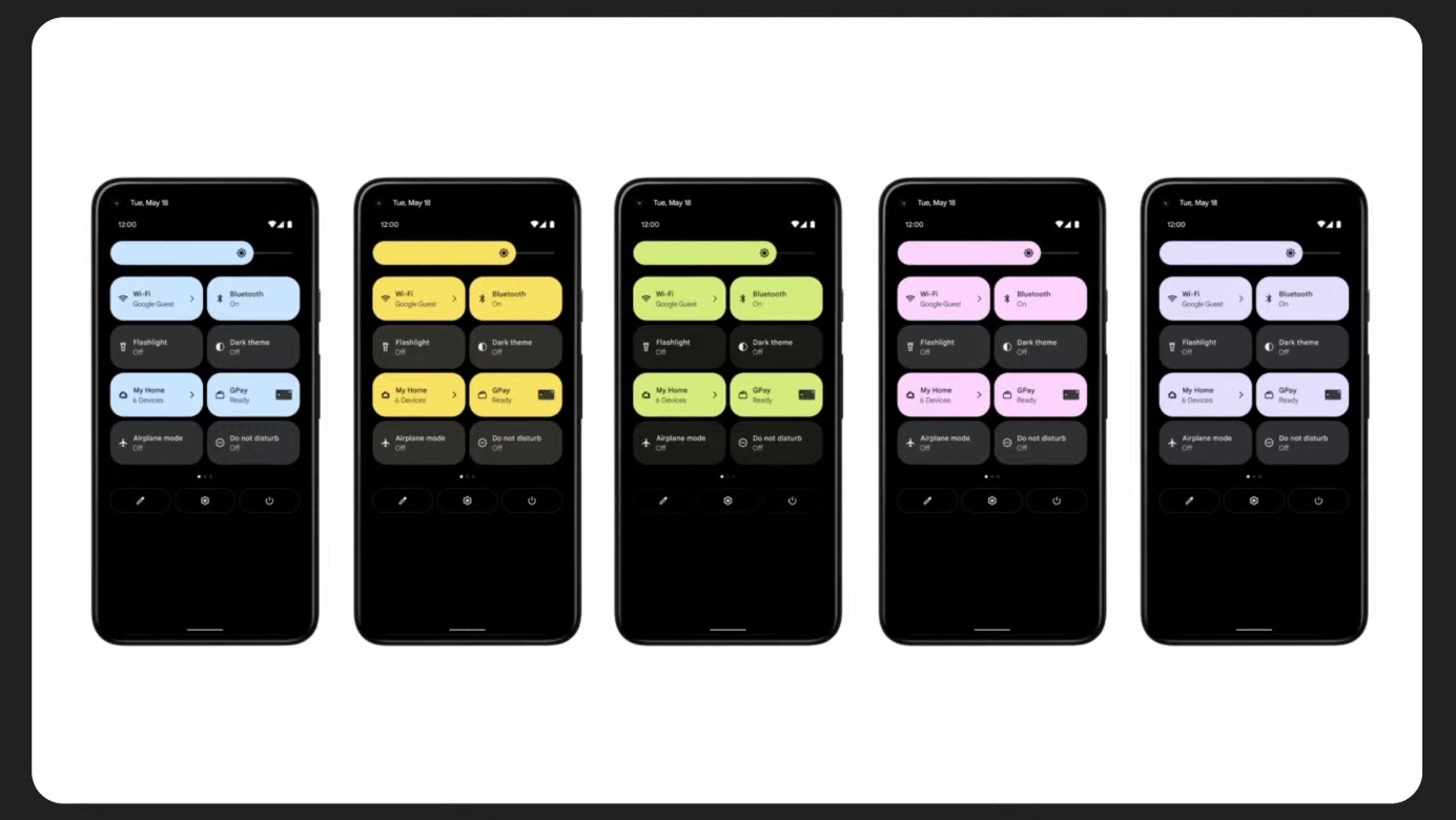
The notification shade is one of many things to get a complete overhaul in Android 12. It’s consistent with Android 11’s power menu. In place of circular icons, we are seeing rounded rectangular ones, each able to show more information. The Quick Tiles is fresh with four tiles showing up in the first and eight tiles in the second pulldown. Thus, this could not be everyone’s cup of tea.
The notification along with the always-there media player sees a redesign to align them with the tiles. The brightness slider also goes with the tiles on top of fresh animations. The slider shows up in the second pulldown.
The notification shade applies to Android 12’s new color extraction feature as well.
Settings
Remember how Samsung introduced large headers within settings in its One UI, the topic which the company discussed for a long time, primarily the significances of one-handed accessibility. Large headers bring in tappable information to the middle such that users don’t need to reach the top of the screen.
Settings within Android 12 have large headers as well with each page leveraging color extraction, hence everything looks and feels together. If you toggle something within settings, you will notice rounded rectangle shapes appearing as highlights. Not to mention, it’s used elsewhere in the system along with the color profiles including keyboard, calculator, volume slider, widgets, etc.
Since this is just the announcement and we have the beta version rolling out, we are yet to see the true potential of Android 12. So, be with us for every update and development.


